About
Fiona Solitaire is one of the leading jewelry stores in India. It is also the fastest moissanite selling company in Asia. It is also one of India's first online fine jewelry store.
Go to Fiona Solitaires
The Challenge
The client wanted an online platform to sell and showcase their products. In a country like India where people prefer buying jewelry from the store, the main challenge was to identify the target audience and also validate the ROI.
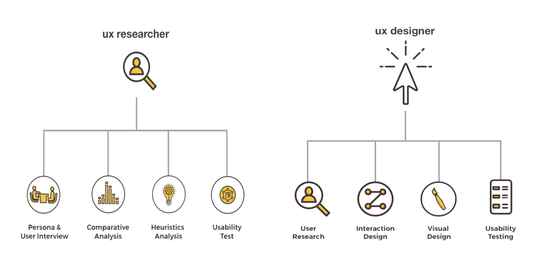
My role

Interviews
We conducted over 50 interviews. These interviews helped us determine the target audience of the website and gave us a good insight to the the customer requirements. A detailed interview script was created for the interviews. Some of the research findings are listed below.
Research Insights
Conducting interviews helped us get some great insights. Some of which are mentioned below.
- Trust is the most important aspect for users when purchasing jewelry online.
Solution: Included a section showcasing the history of Fiona Solitaires and also displaying testimonials from clients. - Users prefer high resolution big images.
Solution: Using Hi-resolution images and also including a magnifying glass for more in depth details. - Users would like to see the breakdown of the cost.
Solution: Including the breakdown of cost on each product page. Being so transperent also helped build the users trust. - Users would like to see products which are ready to ship.
Solution: This was addressed by simply adding a 'Ready to Ship' category to the main navigation menu. - Users would like to see jewelery based on occasions.
Solution: A special menu category would appear on the main menu a fews days before special occasions like valentines day.
Cardsorts
Performing card sorts enabled us organize the different categories. It helped us create the primary and secondary categories in the main navigation menu. The participants were asked to perform an open card sort first and then a closed card sort. Organization and categorisation were based on the results of the card sort.
Sitemap
Being an Ecommerce company, the website had more than 200 pages including the individual product pages. To provide the best experience and easy navigation for the users, the sitemap was one of the most essential aspect while designing. It helped us visualize the organisation of the site and how different sections would be linked together. Creating the site map enabled us to provide a seamless navigation flow.

Wireframes
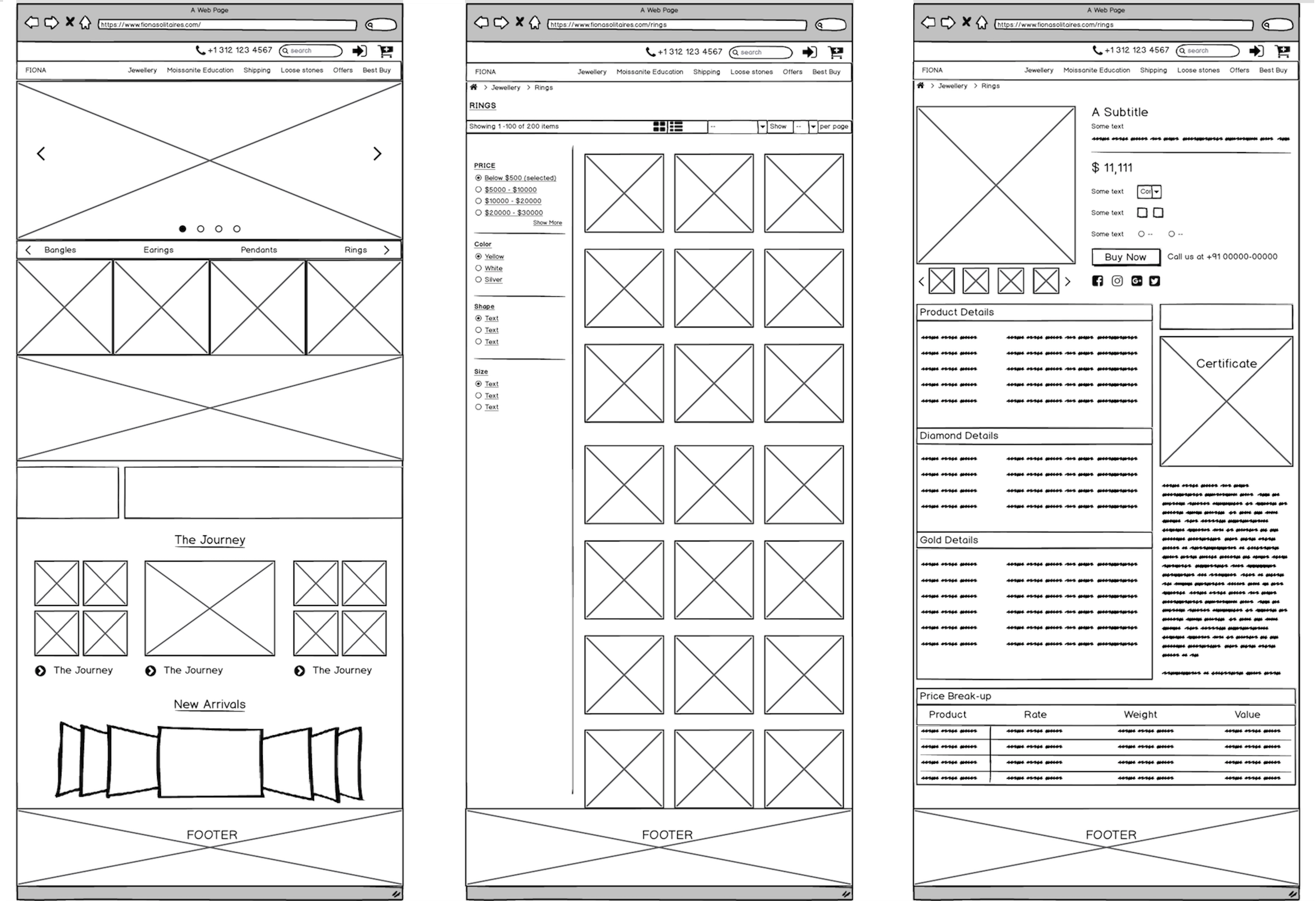
Wireframes were created based on the sketches and iterations to the sketches. These were also tested to see the navigation structure of the website.

Testing
The prototypes were tested for usability testing. Changes were made to the prototypes based on the feedback from these tests. The developed website was tested in person and online on Usertesting before being launched.
Accomplishments
- Conducted user research to find target audience for an online store and interview more than 50 people.
- Sketched more than 50 layouts for different pages, created wireframes, HI-FI prototypes outlining the user flow and interactions of the website.
- Performed card sorts and created site maps to provide and easy navigation structure.
- Designed a special occasions page which made navigation and search easy.
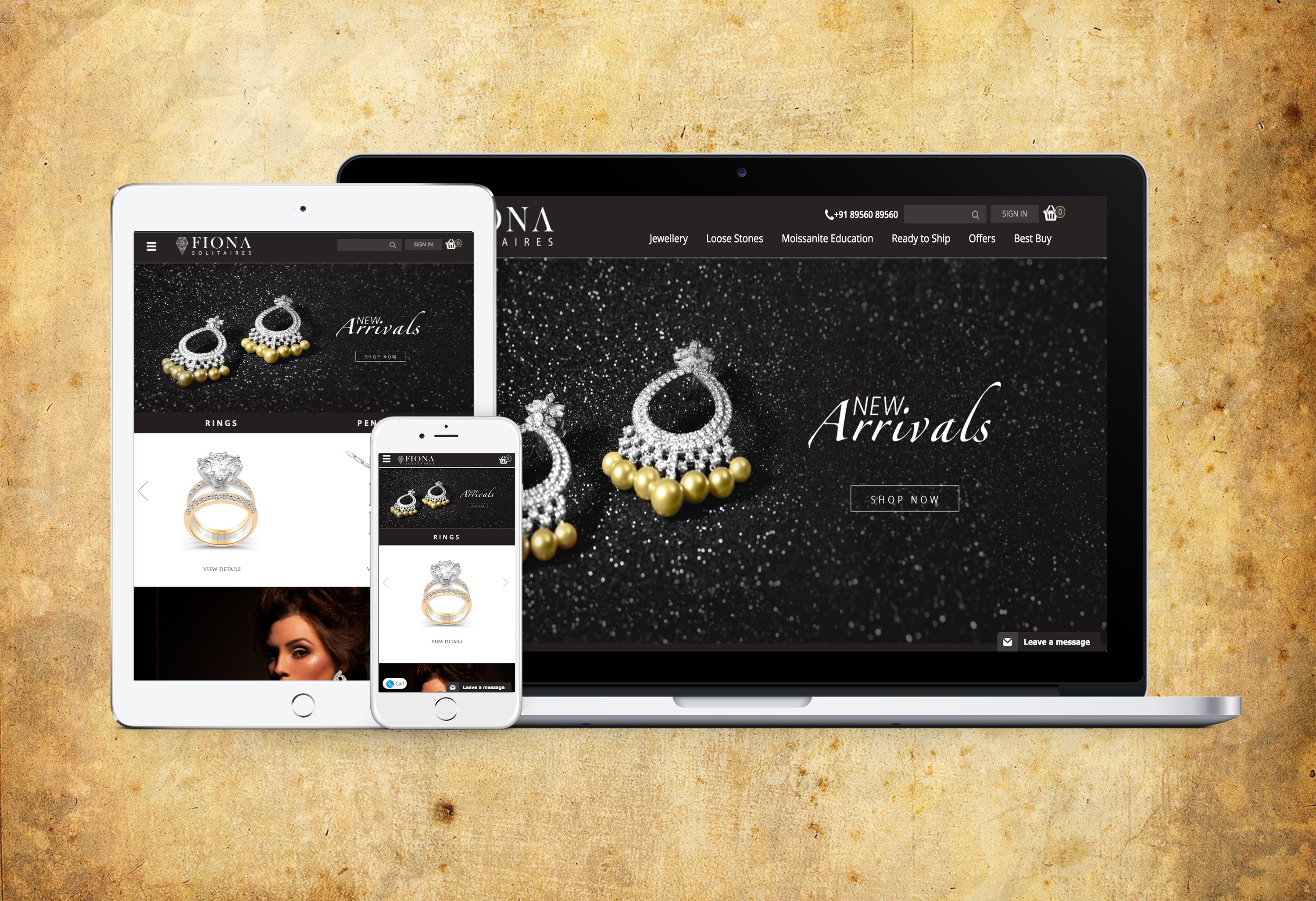
The Final Product

To visit the site click the link below
FIONA SOLITAIRES